Deep Blue, Gold, and Mustard Triadic Color Harmony Look #becolorsmart
Deep Blue, Gold, and Mustard Makeup Look
Triadic Color Harmony #becolorsmart

Here's another quick casual lesson in color theory, in hopes that you can learn tools and how to pair colors so you can #becolorsmart and create looks using more color. This look is pretty saturated and has pretty pure hues (no added white, grey or black) since I think it's easier to see when the colors are bold, and we all know I love really bold colors. I'll be sharing similar posts that have a pop of bold color and also some with color but muted or subtle colors, so follow me here or on Instagram @rebeccaahoresmua so you don't miss out!


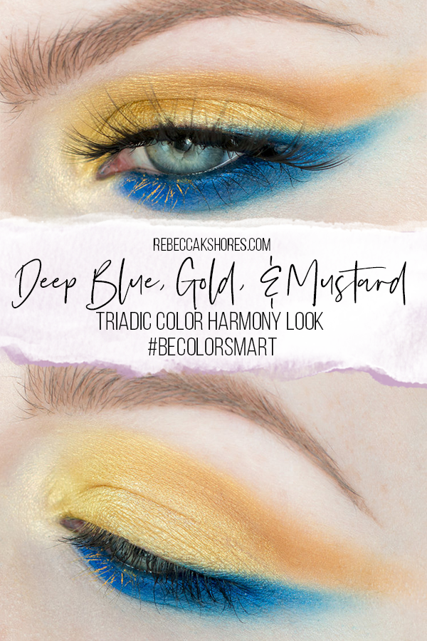
For this look I wanted to use a triadic color scheme again (see my previous triadic look), with saturated colors. I went with blue and yellow, then I needed to pick what actual products I would be using. I chose a yellow (gold), Stay Gold (from the Urban Decay Kaleidoscope palette) as my yellow and then two blues, TRM (from the Urban Decay Kaleidoscope palette),that is slightly shaded (black added) and slightly cooler, and Chaos (from the Urban Decay Electric palette) which is slightly warmer and a purer hue.

Here's a "color wheel" missing some colors, but I added red for an example of where it would be. A triadic color harmony is equality spaced around the color wheel, and if the color scheme I am using I dropped the red. I also wanted to use more colors, so I added a yellow with bit more red in it, Edge from the ABH Subculture palette. I usually like to pad one or more of my colors with a color that sits next to it on the color wheel. I also used the Make Up For Ever Star lit powder in 02, which is yellow, but with white added. I also wanted to add a liner to my water line and a pop of color on my lashes, so I used the Make Up For Ever Aqua XL Paints in L22 and then M40 and L30 mixed. These match the yellow and blue tones I picked earlier and keeps my palette limited. Added products, but not adding new colors. This is why I think knowing some color theory and being able to mix helps so much when creating looks.

Here's an example of the colors in the palette I made, just as color blocks. I started with a triadic harmony as my base, dropped the red, added a second yellow-orange color, and more depth with a tint and shade. If you wanna use bold colors, having a limited palette can really help keep your look cohesive while still using high impact, full saturation colors. Playing around with a color wheel or color palette app can also help you see your colors before you even touch a makeup product.

This is the look I created, I kept my main colors separate, but since neither contain red (except for Edge), if I were to blend them I'd get a green (and then get an analogous harmony), so these colors you could work with them blending in areas, but it will change from a poppy triadic color harmony to more of an analogous harmony which is more harmonious which I didn't want for this look. Something to note, which makeup you're not working with a blank canvas, you have color in you skin, hair, eyes, etc so I could be doing a gold only look and my eye color would make it a similar color harmony. When working with color on faces you can think about the color only on the eyes, the color on the whole face (add a red lip or wear a red shirt, and you've got all the parts of a triadic color harmony), and/or take the colors on the face into account when making your color scheme. For this example I am just thinking about the product colors, but it is definitely something to be aware of.

I hope you found this post helpful and that you're excited for more color theory posts in the future. If you try out this look or want me to see your colorful looks use the hashtag #becolorsmart and I also check the hashtag #rebeccakshores. Thanks for reading and share with a friend that loves color.
-Rebecca