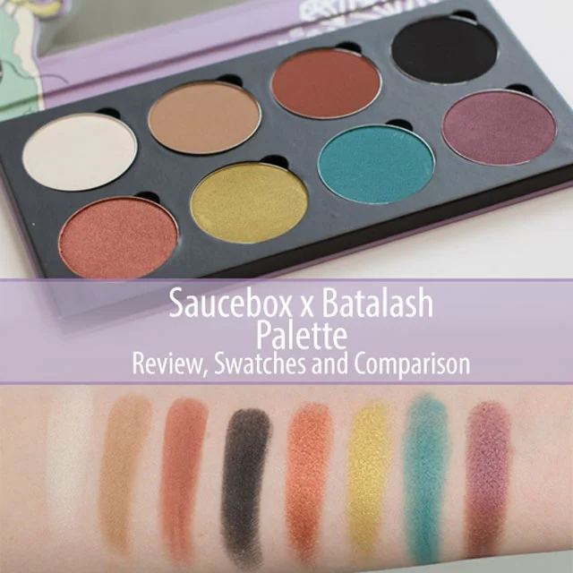
Saucebox Batalash Palette Review, Swatches and Comparisons
Saucebox Batalash Palette Swatches and Comparisons

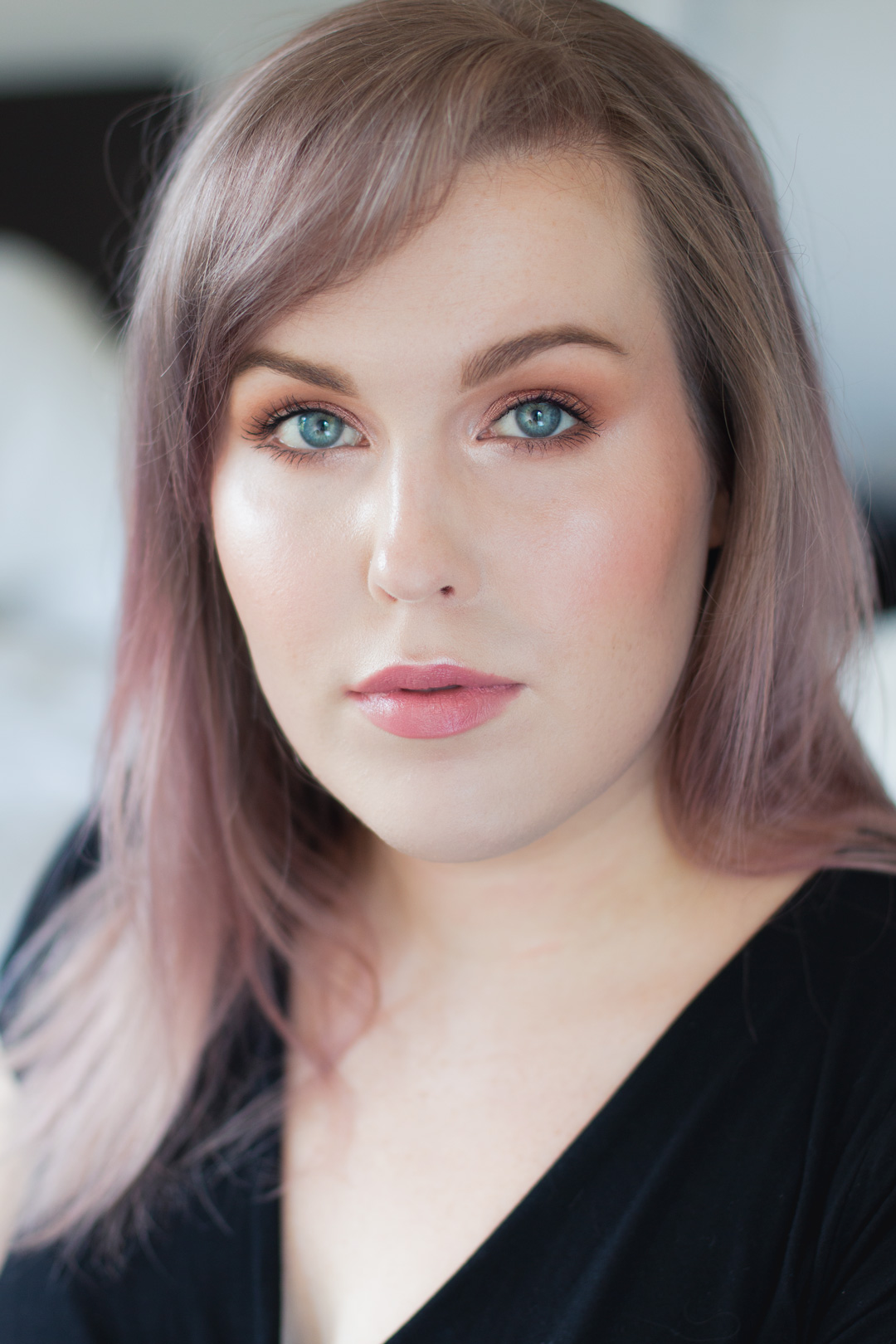
I wanted to share with you guys some swatches of the Saucebox Batalash Palette and compare some shades with other shades from the Saucebox Etude, Temptation, Creme de la Creme and Forbidden Fruits palettes. I also share my thoughts on the Batalash palette as well!
Disclosre: I was sent this product as a press sample, this post isn't sponsored. As always, all opinions are my own. Some links are affiliate links.


There are eight eyeshadows in this palette, each pan is 4 grams. That is huge! A big reason why I love Saucebox is the large pan size. It's also why I think the $60 price point is a very good deal.

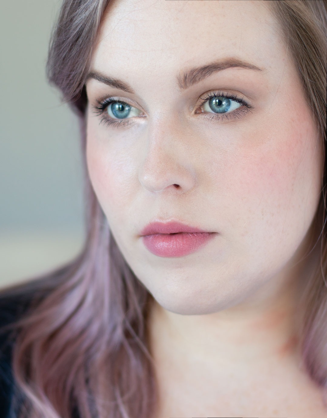
Let's talk about the individual eyeshadows and colors!
Vanilla is a very pale, cream color with a yellow undertones and a matte finish. It has a smooth, creamy texture and blends easily. I like to use it as a highlight or base shadow.
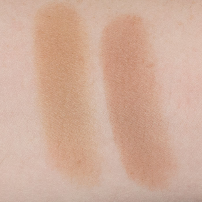
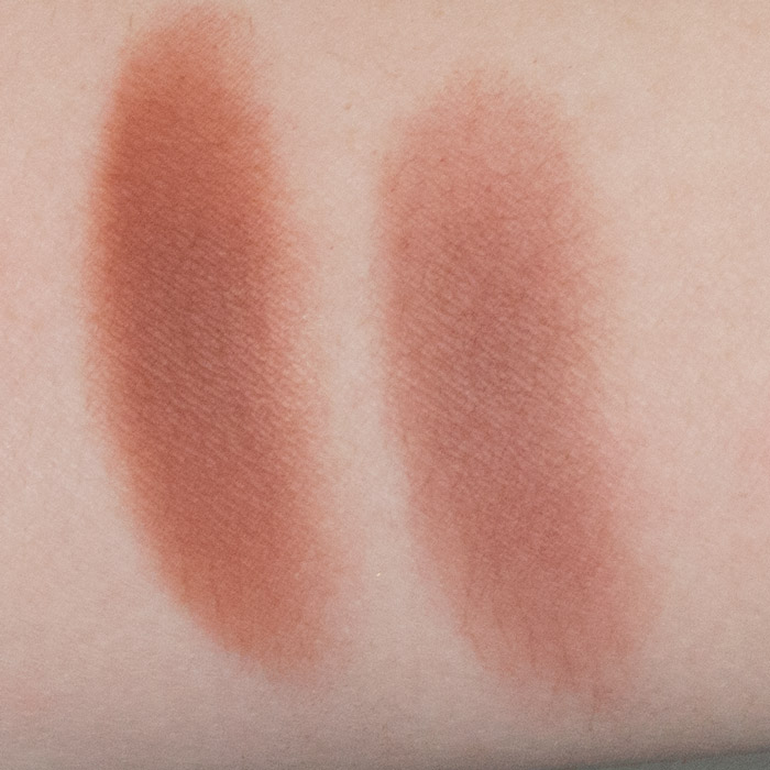
Winter Brown is a light brown with neutral mustard yellow undertones and a matte finish. It reminds me of a more brown version of Mac Uninterrupted. I find that this color works great as a transition shade or as a light crease shade as it also is very pigmented and blends easily.
Cinnamon is a medium-deep warm rusty brown with a matte finish. This color is my favorite of the four matte shadows, it works as a lid color or blended into the crease. It is also very pigmented and blends easily. Cinnamon also works well with all the shadows in the palette, so it can be a go to neutral to break up the color.
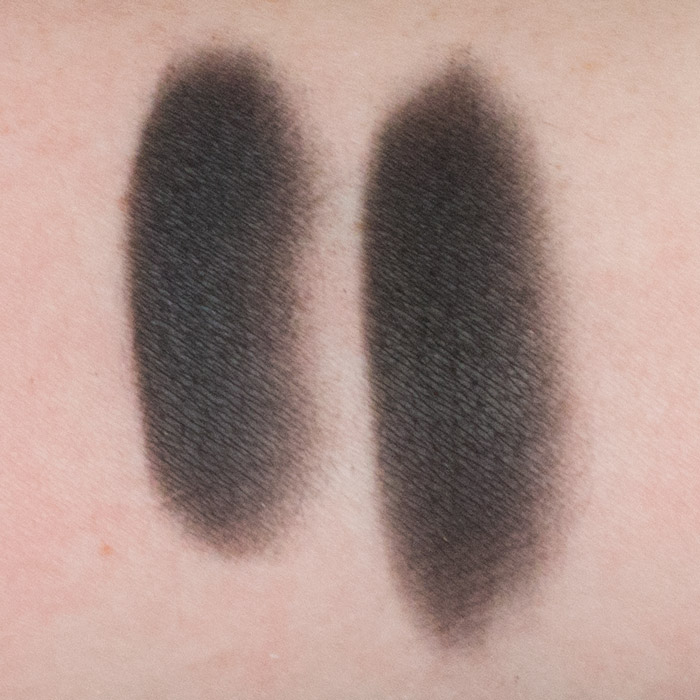
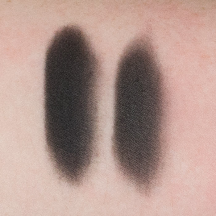
Lace Noir is a matte black. I still find Black Widow to be the blackest black, but this is close and darker than Toffee. It is very pigmented and is the least bendable of all the shadows, however, it isn't hard to blend for a black shadow. I use it as a black (duh), and also to deepen up the colors in the palette.
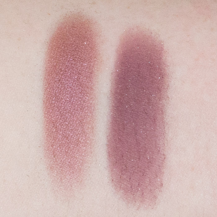
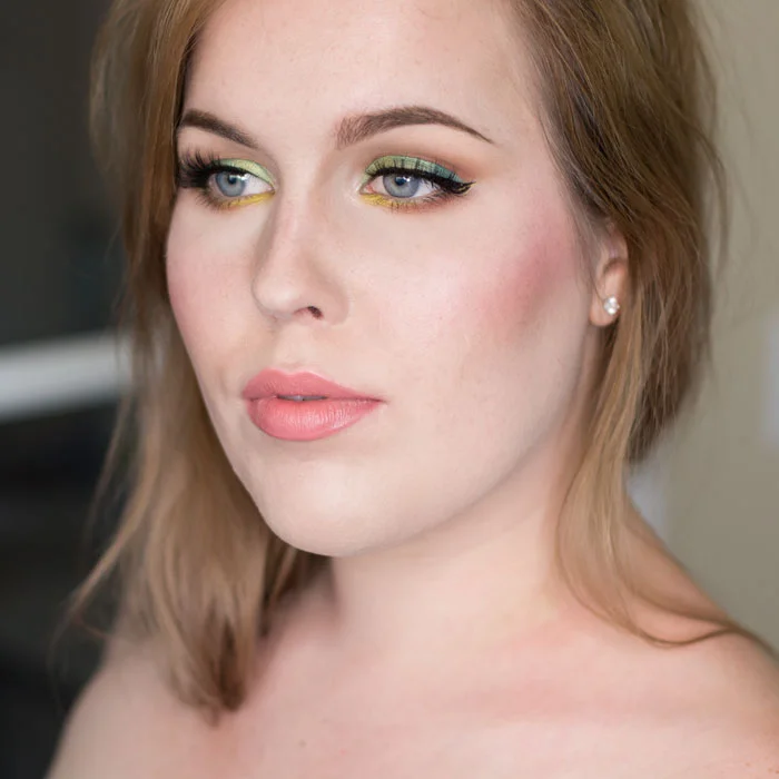
Enigma is a bright warm copper with a metallic finish. I can't stop using this shadow as I love coppers against blue eyes. This is the most creamy of the bunch and heavily pigmented. I love this as a lid color, a pop of color or as a highlight.
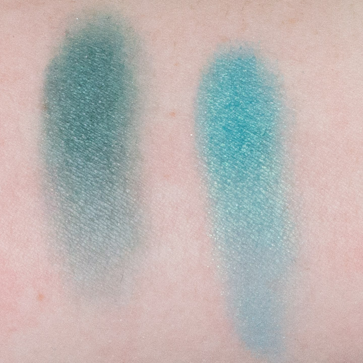
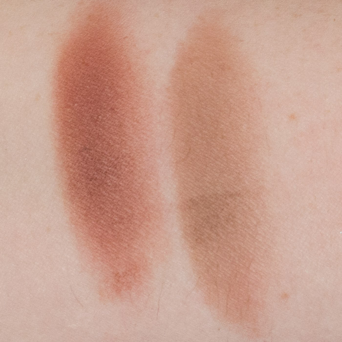
Electro is a muted chartreuse with a metallic finish. This is the most unique color in the palette and I am in love with it. If you've been following me for a while you'll notice that I love acid greens and this color lets me use a similar color that's less striking. It is very easy to blend and can be sheered out or you can really pack it on with a clean finger, it is very pigmented. I use this everywhere, as a highlight (so fun), a lid color, pop of color, you name it, it works for a lot of things.
Popper is a muted green-blue teal with a satin finish. Unlike the other colors, this is the least metallic and I would consider it closer to a satin. This shade is the least pigmented in the palette so you may want to use a clean finger if you want a bright blue lid of the like. I think this color is a nice addition since teals are very pretty on most eye colors, but since it is muted it is quite easy to wear for those less into bright colors. I think this works great on the lid, a pop or color, in a smokey eye or blended out into the crease.
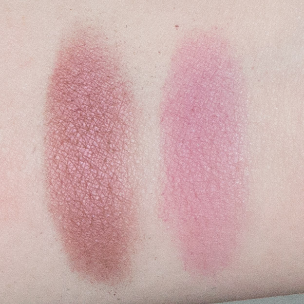
Nova is a muted plum with rust undertones with a metallic finish. Another pigmented and easy to blend shade. This color was a surprise for me since I usually don't get excited for purples, but since this has a unique red undertone it plays very well with the warmth in cinnamon and I like wearing them together. This color also works well in a smokey eye, or in the crease or as a crease color.
Swatches of the SauceBox Batalash Palette
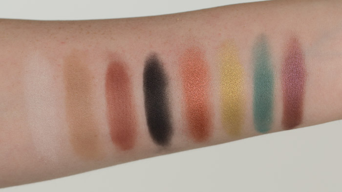
Swatched on top of primer with a Sigma E25 Blending brush
Vanilla, Winter Brown, Cinnamon, Winter Brown, Vanilla, Nova, Popper, Electro, Enigma

Swatched on bare skin with fingers
Vanilla, Winter Brown, Cinnamon, Winter Brown, Vanilla, Nova, Popper, Electro, Enigma
As you can see the colors perform well applied with a brush or fingers. The texture of these, as with Saucebox's other eyeshadows are my favorite shadow texture.
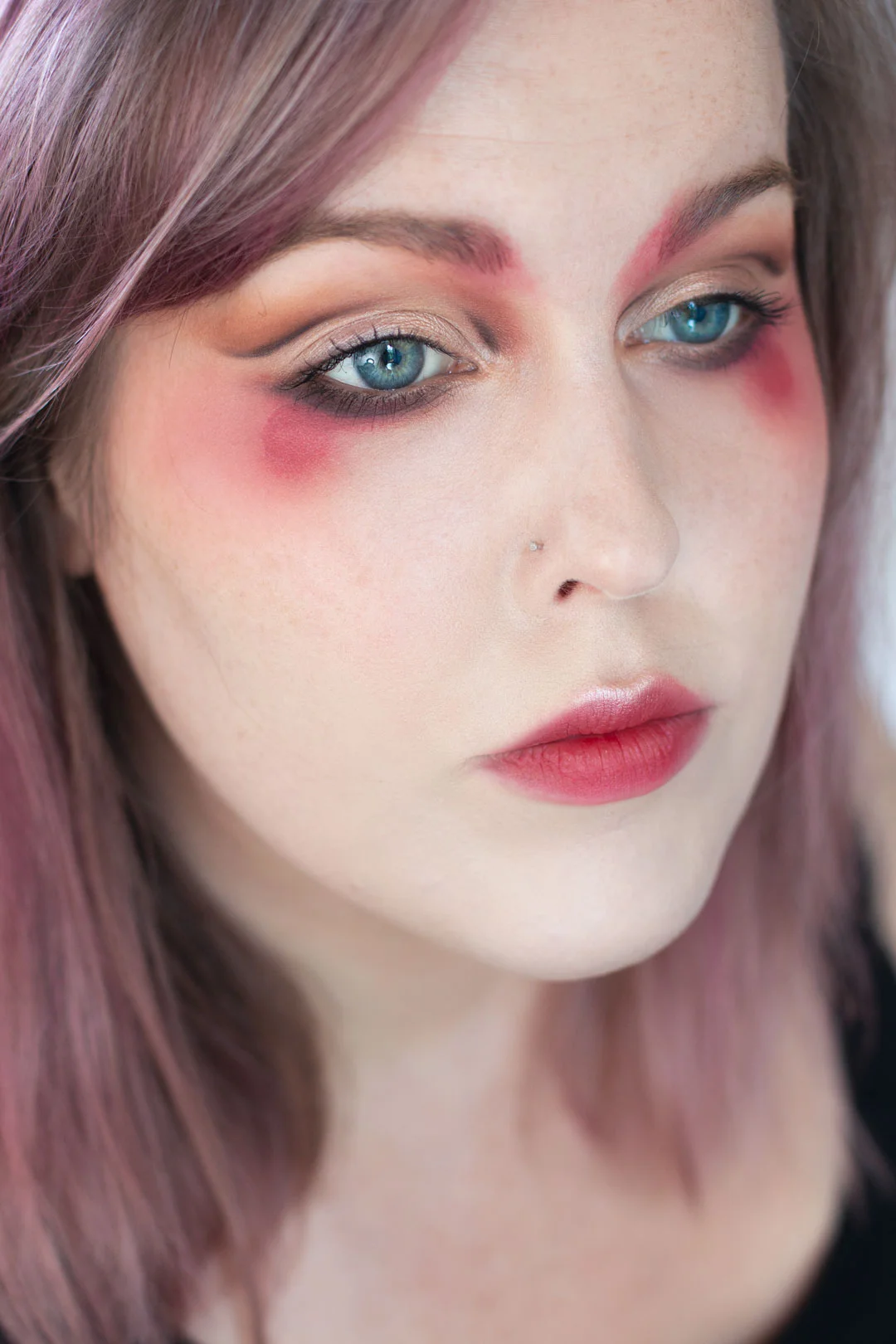
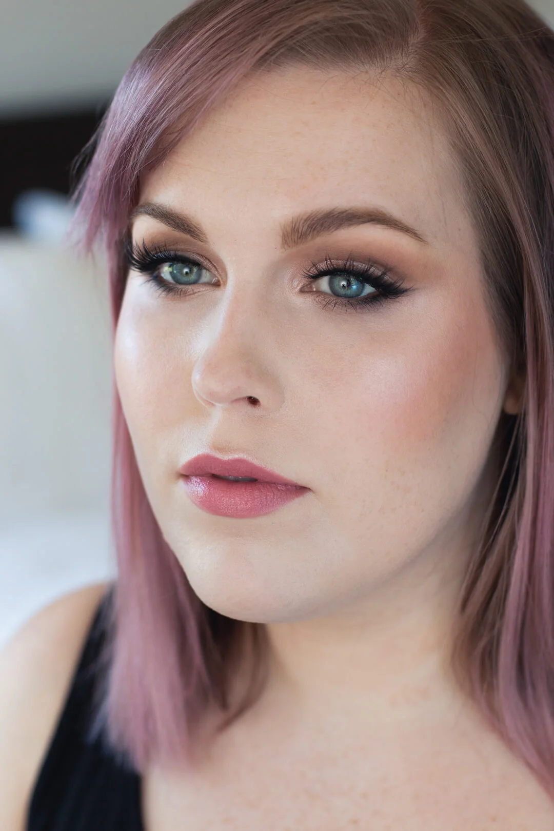
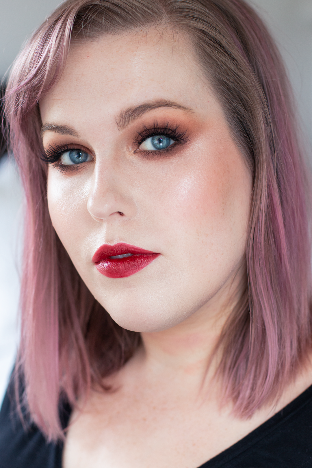
Overall I really like the Saucebox Batalash Palette and I am already reaching for it often. I think the Batalash girls did a great job in creating colors that can be used in a range of looks yet still are very cohesive. It's definitely a palette I can grab if I am going to have a weekend in Oregon or any other travels where I may be wearing a range of looks from simple to glam.
-Rebecca
Follow me! YouTube | Instagram | Twitter | Facebook | Bloglovin'
Comparison Swatches