Color Theory
This is going to be a different type of post than normal, it'll be closer to art as it's is about color theory. Since I have received a lot of questions and comments about the color choices in my makeup looks. I have a Bachelors of Arts degree in Fine Arts and have learned a lot about color theory, which I incorporate into my work with makeup. So, in this post I will be going over how different colors relate, as well as having examples of using these color schemes with makeup.
A Few Definitions
Hue - The pure color, independent of the saturation and shade/tint. In other words, a red (could be warm or cool) that is red, not pink (pink would be tinted) or oxblood (would be shaded).Hues can be changed as well: shades are when you add black to a hue; tints are when you add white, and tones are adding gray.
Colors and Mixing
I am going to go over this quickly since this is pretty basic, but it's always good to review. This info will come in handy for mixing lip colors or if you have cream colors like that MUFE Flash Palette.
Primary Colors
Primary colors are Red, Yellow and Blue. These colors cannot be created by mixing.
Secondary Colors
Secondary colors are Purple, Orange and Green. You can create these colors by mixing two of the primary colors. Yellow + Blue = Green, Red + Blue = Purple, and Red + Yellow = Orange.
Tertiary Colors
Tertiary colors are created by mixing a primary color with a secondary color, or two secondary colors.
Warm/Cool Colors
We'll talk about this in regards to the color wheel first.
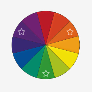
The warm colors on the color wheel are red, orange and yellow & the cool colors are blue, purple and green. This can relate to makeup in a lot of ways. You can pair warm colors together for a more cohesive look. You can also determine your undertones and then figure out what colors may work best for you.
Since you're not always going to be using straight hues in your makeup. lets talk about the more subtle changes from warm to cool.
Here is where we start getting into what will really help you in regards to makeup: undertones. The red on the left is a warm red (it contains more yellow undertones), the center red is a true red (equal amounts of blue and yellow) and on the right is a cool red (containing more blue undertones).
If you learn nothing else from this tutorial, learn this.
What is true for all colors is: there is a true version, a warm and a cool. This is also how you find your undertones. Someone with a neutral undertone will have equal parts warm and cool tones to their skin, while someone with warm undertones will have more yellow and someone with cool undertones will have more pink.
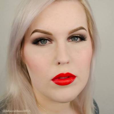
In regards to undertones in your skin, remember that warm and cool tones will push against each other and seem to "pop" when you place them next to each other. For example, if you want to find a red that complements your skin, go for one that matches your undertones. Cool skin undertones go with a cool red like MAC Ruby Woo, but if you have warm skin undertones go for a warm red like Bite Sherry. Which is not to say that you can't have cool toned skin and wear a warm red. The red will just be a touch more bold because it will "pop" in contrast to your cool undertones.
Here you can see cool and warm tones in one eye shadow look. The edges are cool and my eye color is also cool, but there is a warm gold in the center.
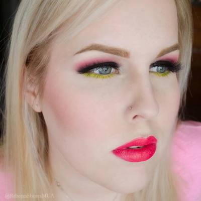
This look is paired with a warm red, so it really pops against the cool colors in the eye shadow.
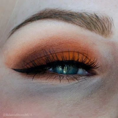
You can also think about warm and cool in regards to the shadows you choose. I have blue eyes which are cool, so using a warm gold/bronze shadow will really make them pop.
You can also use warm and cool colors together like this. Warm on the top and cool on the bottom--the combinations are endless.
Monochromatic - These are colors that are the same hue, but different shades, tones or tints.
This look is all using OCC Grandma, so it's just different intensities of the same color.
You can always incorporate other neutrals into the color scheme you choose. Here I am using shades of purple, but also using black.
Complementary - Two hues opposite each other on the color wheel. This is a very high contrast look. You can make a complementary color scheme more wearable by pairing one at a full saturation and the other color more toned down.Also, if you layer/mix complementary colors they will neutralize each other. This is how color correcting works. Green and Red are opposites on the color wheel, so if you mix/layer them they will neutralize each other. For example, if you have a red blemish, you can use a green product to neutralize the red. Same goes with peach/orange to correct blue under the eyes. One thing to remember when you are using complementary colors where they will be placed next to each other, is to be careful when blending since the colors will easily muddy and neutralize each other.
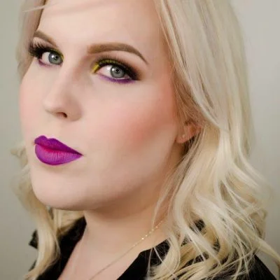
This is a very bold and striking look. I purposely chose a deeper purple to pair with the full yellow so that the contrast wouldn't be too jarring.
Remember, they key to blending complementary colors which are close together is not to mix/muddy them.
Here blue is used at a high saturation, but Orange is tinted and sheer, so it appears softer.
.
You can also use this technique with your own features. Blue it the opposite of orange, so using an orange shadow will make blue eyes pop.
Split-Complementary - One hue and two other hues that are spaced equally apart from its complement.
This is a high contrast look, but it's less jarring than the complementary color scheme.
Tetradic
- This color scheme uses four colors arranged into two complementary pairs.
My pairing here was blue, orange, purple-red, and yellow-green, so two pairs of complementary colors.
To make this color scheme more wearable I used Orange very lightly/unsaturated so it wasn't too over the top
Triadic -
Three colors evenly spaced in the color wheel.
This color scheme is one of my favorites since it's fun and vibrant but more subdued than a split complementary. Sometimes I only use part of the color scheme, by leaving one of the colors out. This color scheme very wearable if using one hue full force and using the other two to accent.
Here I used the whole color scheme of green, purple and orange.
Here I only used two hues, just orange and green and left out purple.
Analogous -
These are hues that are next to each other on the color wheel.
This is a really easy color scheme to use since the colors are close to each other on the color wheel. It's great to use to create gradients and it's more interesting than just a monochromatic look.
Here I've only used the analogous color scheme just on my eyes in a gradient.
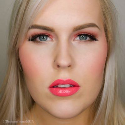
Here I've used the color scheme throughout my look: red-purple and purple on my eyes and then red on my lips.
I hope this is helpful and you're not too overwhelmed with information. Please comment below if you have any questions and I'd be happy to answer them!

